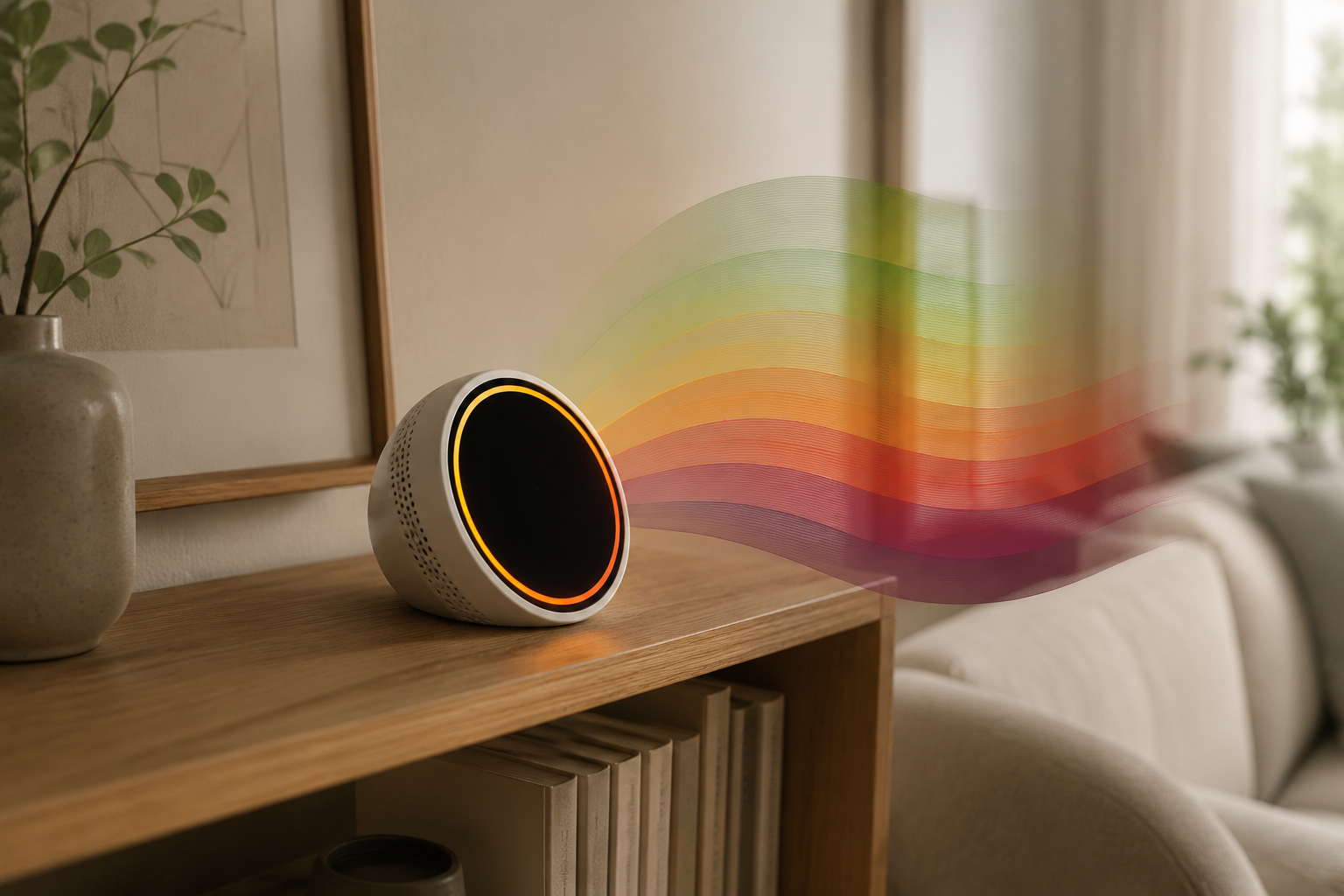
When a smart home air quality monitor turns orange or sends an alert that says AQI 120, the useful question is not whether the air is “bad.” It is which scale the device is using, what that color means on that scale, and who in the house should change behavior first.
If the alert is using the EPA Air Quality Index, AQI 120 sits in the orange band: “Unhealthy for Sensitive Groups.” That does not mean everyone needs to panic or seal the house immediately. It does mean children, older adults, people with asthma or heart and lung conditions, and anyone unusually sensitive to air pollution should reduce exposure while the reading stays there.[1][2]
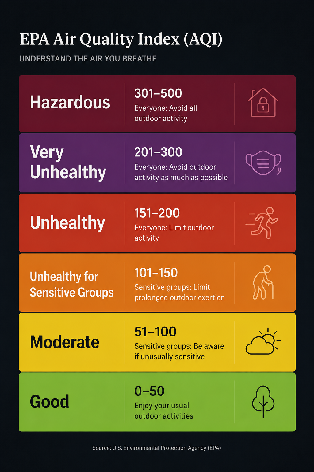
| Color | AQI range | EPA level | What it means at home | Reasonable first action |
|---|---|---|---|---|
| Green | 0–50 | Good | Air quality is satisfactory for most people.[1] | Keep watching the trend; no special action is usually needed. |
| Yellow | 51–100 | Moderate | Acceptable overall, though unusually sensitive people may notice effects.[1][2] | Check whether the number is rising and whether anyone sensitive feels symptoms. |
| Orange | 101–150 | Unhealthy for Sensitive Groups | Sensitive groups are the first people expected to be affected.[1][2] | Reduce exposure for sensitive household members; ventilate or filter depending on the source. |
| Red | 151–200 | Unhealthy | Some members of the general public may experience health effects; sensitive groups face greater risk.[1][2] | Cut down exposure for everyone; run filtration and avoid adding more pollutants indoors. |
| Purple | 201–300 | Very Unhealthy | Health alert conditions; the risk of health effects increases for everyone.[1] | Treat it as exposure management: stay indoors if outdoor air is the source, filter indoor air, and protect vulnerable people. |
| Maroon | 301–500 | Hazardous | Emergency conditions; everyone is more likely to be affected.[1] | Minimize exposure and follow local public health guidance. |
The six AQI colors are the translation layer
The EPA AQI runs from 0 to 500 and divides that range into six color-coded levels: green, yellow, orange, red, purple, and maroon.[1] A smart monitor’s LED ring, app tile, or voice announcement is only useful if you can connect it back to one of those bands or to the manufacturer’s own alternative scale.
Green and yellow are usually the easy ones. Green means the reading is in the Good range. Yellow means Moderate: acceptable for many people, but not a total all-clear for someone unusually sensitive to pollution.[1][2] In a house, those levels usually call for attention rather than intervention. Look at the trend, notice whether the reading is climbing after cooking or cleaning, and avoid creating a second pollutant source while the number is already moving up.
Orange is where smart home alerts start to feel irritatingly vague. A glowing amber ring can look like a mild warning, a serious problem, or just another appliance asking for attention. On the EPA scale, orange is specific: AQI 101–150, Unhealthy for Sensitive Groups.[1] The first practical question is whether anyone in the home belongs to one of those groups. Cleveland Clinic’s guidance highlights children, older adults, people with asthma, and people with heart or lung disease as groups who should pay closer attention when air quality alerts rise.[2]
The action at orange depends heavily on the source. If the spike follows searing food, burning toast, or a candle, opening a window may help if outdoor air is cleaner. If the outdoor AQI is also elevated because of smoke or regional pollution, opening the window may bring the problem indoors. In that case, running a purifier, using a range hood that vents outdoors, and pausing the indoor source are less dramatic and usually more sensible first moves.
Red changes the audience. It is no longer only a sensitive-group alert. EPA defines red, AQI 151–200, as Unhealthy; some people in the general public may experience health effects, and sensitive groups may experience more serious effects.[1] At home, that means the reading deserves a household-level response: reduce exertion in the affected air, run filtration if available, stop obvious sources such as smoke or high-heat cooking, and avoid assuming the alert will resolve just because the color is familiar.
Purple and maroon are not just stronger versions of orange. Purple, AQI 201–300, is Very Unhealthy; maroon, AQI 301–500, is Hazardous.[1] At those levels, the point is to reduce exposure, not to debate whether the device is being fussy. If the source is outdoors, close up the home, reduce outdoor air intake, and filter indoor air. If the source is indoors, remove or stop the source and move people away from the affected space while the reading drops.
For a deeper look at the purple band specifically, the existing guide to a code purple alert on a smart air quality monitor is the better next stop.
Your monitor may not be showing the EPA scale exactly
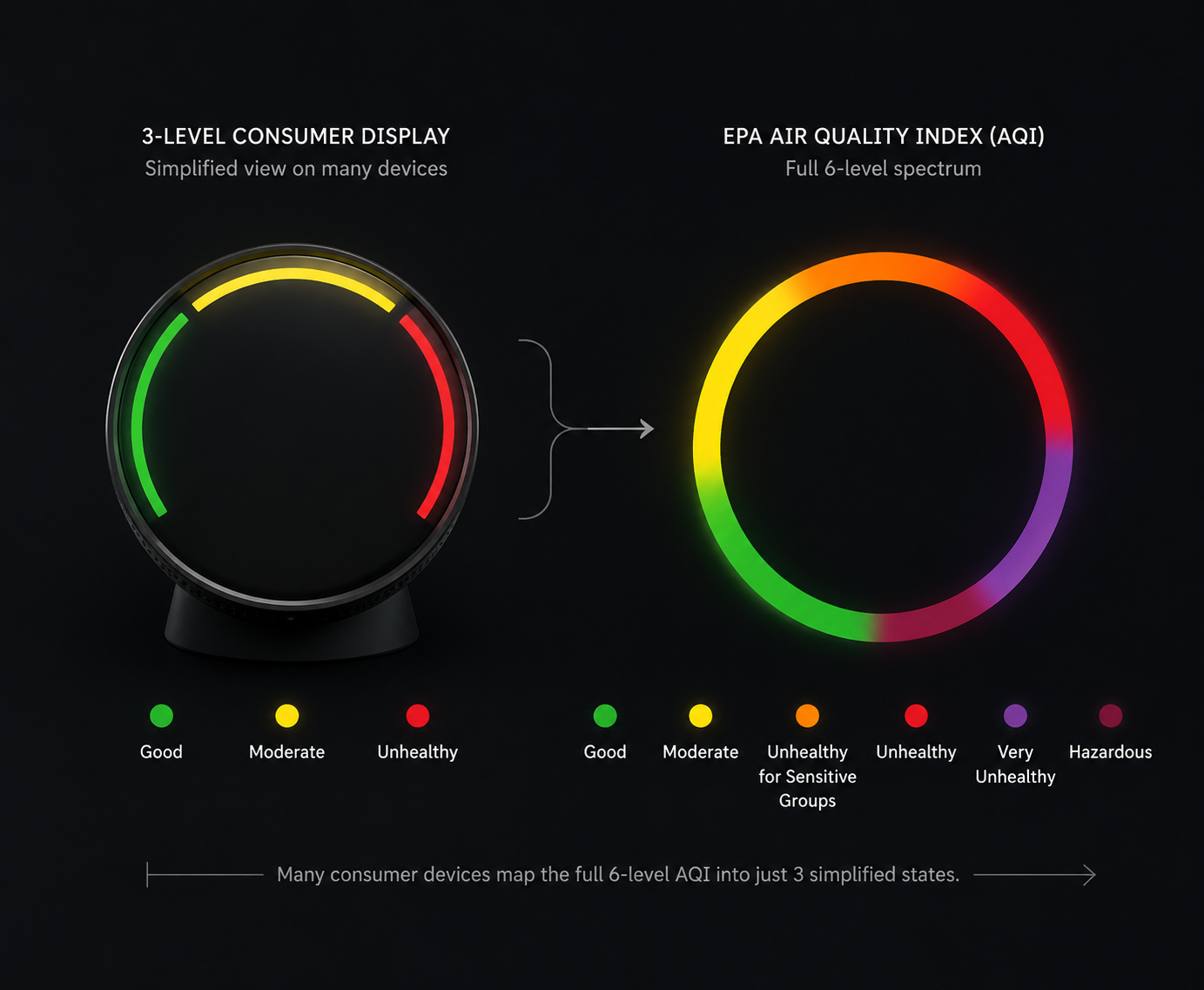
This is the part that causes the most unnecessary confusion. Many smart home monitors borrow the language of the EPA AQI, but the device in your living room may be doing one of three different things:
- Showing a single AQI score, such as 42, 120, or 178.
- Showing a simplified status, such as good, moderate, poor, or unhealthy.
- Showing raw pollutant readings, such as PM2.5, CO2, or VOCs, and then assigning its own color.
Those are not interchangeable displays. A monitor that says “AQI 120” gives you a number you can place directly in the orange EPA band, assuming the device is using an AQI calculation. A monitor that turns yellow or red without showing the number may be compressing six EPA colors into three device states. A monitor that reports CO2 or VOCs is often warning about a different indoor-air problem entirely, even if the app uses the same reassuring green-to-red visual language.
Amazon’s Smart Air Quality Monitor, for example, uses its device light and Alexa announcements to communicate changes in air quality rather than asking the owner to constantly read a chart.[3] That can be helpful, especially if the alert gets you to notice a cooking spike or a ventilation problem. But it also means the owner has to know what the device’s status labels actually represent before treating the color as an EPA category.
Other monitors and platforms take a more measurement-heavy approach. Kaiterra’s support materials, for instance, explain air quality readings by pollutant type, including PM2.5, CO2, and VOCs, with threshold-based categories for each.[4] That matters because the correct response changes with the pollutant. A PM2.5 spike after frying food points toward particle removal and ventilation if outdoor air allows it. High CO2 points more toward occupancy and fresh-air exchange. VOCs can point toward products, furnishings, cleaning, or off-gassing rather than smoke-like particles.
This is why “bad air” is too blunt a label for a smart home alert. PM2.5, CO2, and VOCs can all make an app look unhappy, but they do not ask for exactly the same response. If your device gives you a pollutant breakdown, read the pollutant name before you act on the color.
Indoor and outdoor AQI are related, not identical
AirNow’s AQI is built for outdoor air reporting across major pollutants.[1] Your indoor monitor is sitting in a room with cooking particles, dust, humidity, cleaning products, people exhaling CO2, pets, candles, printers, and whatever outdoor air leaks in. That does not make the monitor useless. It makes the context important.
EPA indoor air quality materials note that indoor pollutant levels can be higher than outdoor levels and that people spend much of their time indoors.[5] That is enough reason to take indoor readings seriously, but not enough reason to compare every indoor number one-to-one with the outdoor AQI on a weather app.
Independent monitor testing and buying guidance also treat indoor monitors as useful for catching local, room-level changes that outdoor readings may miss, especially for particle changes near the source.[6][7] The useful point is narrow: your kitchen, bedroom, or nursery can have an air event before the nearest outdoor station tells you anything about it.
If your readings never seem to match the outdoor AQI, placement may be part of the issue. A monitor beside a stove, open window, humidifier, air purifier outlet, or bathroom door will behave differently from one placed in the main breathing zone. For setup and placement details, use the guide to indoor air quality monitoring with smart sensors.
What to do when the alert happens
Start by identifying what the device is actually reporting. If it shows an AQI number, map the number to the six EPA bands. If it shows only a color or phrase, check the app or manual for that model’s mapping. If it shows pollutant values, act on the pollutant first and the color second.
| What you see | What to check | First move |
|---|---|---|
| Green or yellow light | Is the trend stable or rising? | Keep watching; avoid adding new pollutant sources. |
| Orange light or AQI 101–150 | Is anyone in a sensitive group, and is the source indoors or outdoors? | Protect sensitive people first; ventilate only if outdoor air is cleaner. |
| Red light or AQI 151–200 | Is the reading sustained or still climbing? | Reduce exposure for everyone and run filtration if available. |
| Purple or maroon alert | Is the source outdoor smoke/pollution or an indoor event? | Move into exposure-control mode: seal, filter, stop the source, or relocate within the home. |
| PM2.5 spike | Was there cooking, smoke, candles, dust, or outdoor infiltration? | Remove particles with filtration and ventilate only when outside air helps. |
| CO2 warning | How many people are in the room, and how long has ventilation been limited? | Increase fresh-air exchange if outdoor conditions allow. |
| VOC warning | Did cleaning, painting, new furniture, fragrance, or storage chemicals change recently? | Remove or isolate the source and ventilate when appropriate. |
For smoke-specific spikes, especially when PM2.5 rises fast and the room smells like cooking, wildfire smoke, or a fireplace leak, use the smart air quality monitor smoke troubleshooting guide. Smoke events are where the wrong ventilation decision can make the reading worse instead of better.
Sensitive households should set a lower threshold for paying attention. If someone in the home has asthma, heart disease, lung disease, or is very young or older, orange is not just an informational color. It is the first level where the household should decide who avoids exertion, who stays away from the source, and whether the room needs filtration. The smart air quality monitor guide for sensitive groups covers that narrower use case.
A repeatable habit beats a louder alert
The useful habit is small: identify the scale, map the color or number, then choose the least dramatic action that fits the level. Watch green and yellow. Treat orange as sensitive-group territory. Treat red as a household exposure problem. Treat purple and maroon as conditions where reducing exposure matters more than waiting to see whether the light changes back.
If you automate responses, use the same logic rather than a vague “bad air” trigger. A purifier, thermostat fan, ventilation setting, or notification should be tied to a known AQI band or pollutant threshold. The guide to automating a smart air quality monitor at hazardous levels covers those threshold decisions in more detail, and the three-device air quality defense setup shows how a monitor, thermostat, and purifier can work together at higher AQI levels.
If your current monitor never tells you whether its red means EPA red, device red, high PM2.5, high VOCs, or high CO2, that is a limitation worth remembering the next time you choose hardware. Clear alert mapping is not a luxury feature when the device is asking you to make a health-related decision.
References
- AQI Basics, AirNow.gov
- Smog And Pollution: What Do Air Quality Alerts Actually Mean?, Cleveland Clinic
- Amazon Smart Air Quality Monitor, Amazon
- Understanding Your Air Quality Readings, Kaiterra
- Indoor Air Quality, U.S. Environmental Protection Agency
- Air Quality Monitors, HouseFresh
- Indoor Air Quality Monitor Buying Guide, Consumer Reports
Community Tips
Share platform-specific variations, steps that have changed after app updates, or tips that helped your installation succeed.
Comments
Join the discussion with an anonymous comment.